Gallery
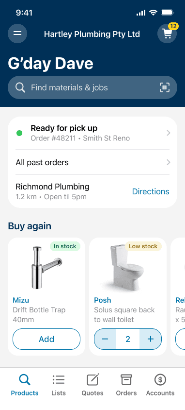
Home screen - maX app
The problem: users repeated the same steps on every visit, even though the app already knew who they were.


Phase 1 - Personalise the home screen
Closest branch surfaced automatically, using location
Product categories reordered around the customer's actual trade, replacing generic categories with relevant ones
Search placeholder text tuned to trade-relevant examples
Closest branch visually segregated into its own card, so a tradie can open the app and get directions in one glance
Phase 2 - Rebuild around what the data revealed
Once usage data confirmed that 88% of sessions start with search and 8% go straight to reordering, that justified a structural rethink.
Moved from a category-led screen to a search-led one
Larger touch targets, to increase accessibility for trade customers
Past orders and commonly purchased products promoted above the fold
Branch locator retained, but repositioned as a supporting action rather than a destination
Account name surfaced, so users who belong to multiple accounts can be sure they're trading in the correct one
Personalisation included:
User's first name
Account name
Products they most frequently purchase, including stock availability at their home branch
Current and past orders
Their closest branch
Personalised landing page
A page within maX that turns a generic 'apply for finance' flow into a pre-qualified offer - naming the customer's business and showing their available credit range upfront, using their existing Reece history. Powered by lending partner Laddr, but built and branded as part of the Reece experience, so customers never feel handed off. Removes the guesswork before they even start applying.
Customer's first name and business name shown directly on the offer
Credit range calculated from their existing Reece account history
Pre-populated application using their maX account details

Native payment flow
I designed a ground-up native payment experience for iOS and Android, not a responsive adaptation of the web flow. The design centred on two principles: make it easy to review what you're about to pay before you commit, and make it unambiguous that a payment has been submitted. I introduced clear confirmation states, prominent in-progress indicators, and layouts optimised for one-handed use on mobile. The experience shipped across 3 iterative releases over 6 months, with usability improvements validated at each stage.


Mobile-first, conversion-first


McLaren Newport Beach - mobile-first dealership site, built to turn browsing into qualified leads. Every core action - get pre-approved, book a service, find a car - sits within a thumb's reach on mobile, ahead of anything decorative, because the target buyer is a busy professional doing research on their phone between meetings, not wandering from dealership to dealership. Trust signals (Google reviews, warranty terms, lender partnerships) are pulled up high rather than buried, so by the time someone walks into the showroom they've already financed, compared, and half-decided - a warm lead, not a cold one.

Mobile-first responsive website design


I redesigned the homepage for Modibodi, a period underwear retailer, using a mobile-first approach. The focus was ensuring the primary call to action, "Shop now," stayed visible above the fold on mobile, with navigation tucked into a hamburger menu to keep the hero message and CTA front and centre. The layout then scaled up to desktop, expanding into a traditional top nav while keeping the same visual identity and hierarchy across both breakpoints.
